
S2E04. The Six Elements of Influential Workplace Presentations
25 minutes
Summary
Too many presentations begin by opening PowerPoint, or thinking about the most interesting pieces of information. And that’s exactly the wrong place to start if you want to be influential. It’s possible to have great data, solid analysis and polished slides, then finish your presentation with “thanks, that was interesting” and watch absolutely nothing happen.
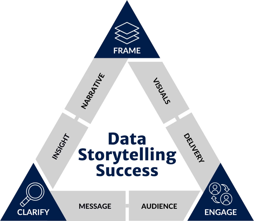
In this episode, Kate and Thomas unpack the Data Storytelling Success Model (The Triangle) that works for all workplace communications and technical presentations. It’s the framework we use with organisations across industries, functions and all over the world to turn informed experts into influential communicators. It’s the framework we use to diagnose why workplace presentations fail to influence and where technical communicators should focus to improve them.
We explain the six essential elements that sit behind every effective presentation. If you’ve ever wondered why some presentations lead to action while others are quickly forgotten, this episode will share with you the essential pieces of preparation you need.
What You’ll Learn
- The common mistake of building presentations for ourselves instead of our audience
- How to identify the one audience member who matters most.
- The “Sticky Note Message” technique for creating clear communication.
- Why insight and narrative matter more than simply sharing information.
- The three questions every presentation should answer.
- How better visuals reduce confusion and increase decision-making.
- How “death by dashboard” has joined “death by PowerPoint”.
- Why delivery is only the tip of the iceberg when it comes to influential presentations.
- How to identify the weakest link in your own workplace communication.
Links & Resources
• Email us: podcast@presentationboss.com.au
• The Presentation Boss Podcast: presentationboss.com.au/podcast
• Kate on LinkedIn: https://www.linkedin.com/in/data-storytelling
• Thomas on LinkedIn: https://www.linkedin.com/in/data-storytelling-au
About The Presentation Boss Podcast
Presentation skills for analysts, technical professionals and anyone whose ideas deserve to be taken seriously.
Every episode is designed to help you communicate complex ideas simply, influence decisions, and build confidence while presenting your work.
From data storytelling and slide design to strategic communication and presentation delivery, we break down what great communicators do and show you how to apply it.
Want To Become A More Influential Analyst?
The Influential Analyst Academy is our professional development community for analysts and technical professionals who want to communicate their thinking more effectively, have greater influence and advance their careers.
Transcript
Thomas: Oh, hi. It is episode four of season two of the Presentation Boss podcast. It’s a discussion episode, which means it’s me and Kate in your home office.
Kate: Yeah. Um, normally on the Zoom episodes, um, the camera’s pointed a little bit there, but this is just the corner of my office, which I think is nice ’cause now you’ll get to see my art.
Thomas: And the wiggly jellyfish.
Kate: Yeah.
Thomas: Lovely. Look, it’s a discussion episode today, and we’re going to talk about the six key elements of communication, and specifically the workplace presentation, the technical presentation, or when we work with clients, we call this the data storytelling success model. Um, because a lot of our clients are working with more and more complex data, it fits.
But it’s the same thing, and that model, it is a triangle when we draw it out, so in shorthand sometimes we just call it the triangle. We’ll- Creative … we’ll explain it. Yeah, yeah. And look, imagine this. I’m sure you’ve probably had this situation where you spend a whole bunch of time, weeks or what have you, on a piece of work, and you’ve got solid data and you know the information and your slides look great, and you present it to, you know, executives or whoever it gets presented to for 15, 20, 30 minutes, and at the end of the presentation the comment you get is, “Thanks, that was interesting,” or, “Thanks, we’ll think about it.”
And in the days that follow nothing changes, there’s no decision, nothing moves, and you kind of get a meeting that just ends with another meeting later on to think about it some more. And it can be really easy to be concerned about maybe the problem lays with the audience, or the problem lays with the data, or the easy one we see is it’s office politics.
Kate: Mm.
Thomas: Or, or you think there’s something wrong with yourself, right? I’ve, I’ve come across this.
Kate: Mm.
Thomas: And we know that the people who have the greatest impact are not necessarily those with the best data or the perfect data, it is communication skills. It’s a communication issue if we’re not getting some kind of decision or result that we want from a, from a presentation.
So in this episode, we’re gonna walk through the six key elements that fix that. And we know the problem occurs long before you open PowerPoint or- you know, start designing something pretty. Um, it’s starts with getting really clear on who you’re speaking to, what’s the decision that needs to be made, and, you know, what’s the story that the data is actually telling.
And I mean, you know, we’ve, we’ve seen, we’ve worked across government, private, multiple sectors. It is always the same six things that we come back to, and working on these fixes things.
Kate: Hmm. And the issue that we see is that, like, when you see a really good presentation, when you see something that’s really successful, effective, it can be hard to know what actually goes into that to make it so effective.
Because what you see is generally not all of it. You just see, you know, the tip of the iceberg. Mm. And there’s so much work that sits underneath it. And what people tend to do is they start their presentation, their report, by opening up PowerPoint, and they start by working on the visuals, the data visualization, the pictures, that kind of thing.
What I call the fun bit. Um, and what is missed and what is skipped is the super important steps that come before that, and they are the things that need to be sorted and worked on that make all the difference to the outcome of your report, of your presentation, um, at the end. So whatever presentation you are doing, these six things, this middle, this model that we are going to talk about, is what you can use to make sure that your presentations are influential, that people remember, that they find clear, and that they can act on.
Um, and of course, we’ve evolved this- … over the years- Mm-hmm … as we’ve worked, as we’ve worked with clients as well.
Thomas: Yeah. And it’s so important, we have found, to get these basics right. They’re probably gonna feel basic, but, you know, it’s important to get this stuff right. It’s the big stuff that holds up the tip of the iceberg, and the idea is when you work through the model each time, you do a little lap of the, of the triangle, the presentation gets better.
So every time you come back to it, you do a lap, you refine a little bit.
Kate: Mm. All right. Let’s walk through the triangle.
Thomas: Yeah. So there’s, uh, you may know, three sides to a triangle, and each one of those sides we have a stage. Um, and the first stage is clarify, being really clear on who and what you’re going to say, who you’re speaking to, what you’re going to say.
And when we don’t clarify these steps of a presentation, you end up going to a meeting or whatever it is, and it feels like you’re speaking a different language to the other people in the room. Like, maybe you’re speaking a more technical language and they’re speaking a more, I don’t know, KPI language, right?
And because it feels irrelevant to them, we end up in that cycle where nothing happens. There’s no action. We just didn’t understand each other. But when we get really clear and we understand who we’re speaking to and, and what we’re going to say, well, we know who we’re speaking to, what matters to them, what their communication requirements are, and exactly what key message we want them to know at the end of the presentation.
Kate: Mm.
Thomas: So in this stage, there are two pieces. The first piece is audience Audience is all about evaluating and understanding exactly who is in the room, who the audience is, and, you know, a specific audience member, the person who needs to understand the information. Yeah. Person who is going to be able to make some kind of decision, that individual.
And, you know, we need to know what their motivations are, their role, their function, their communication style and preference, and their knowledge gap, what they currently know, what we want them to know. There’s… Uh, does it sound like there’s a lot going on in audience? Right? Um, but it’s important because the biggest mistake we make as communicators is we assume that our audience is just like us.
Kate: Mm.
Thomas: That they know what we know, they like what we like, um, their style is the same as ours, and this is one of the biggest mistakes we see is building a piece of communication for ourselves rather than for our audience. And, you know, some of the obvious things is decision-makers tend to think in terms of outcomes.
What does this mean? What do you want me to do about it? And they don’t think about the data points, the methodology, the cute little tweaks that we made to the algorithm or the dashboard, right? Mm. Um, and so the question that… One of the big questions to ask here as well is: What does this audience member, what does this key person, what are they going to walk away and do?
What’s the decision they need to make? What am I informing or helping to happen here? It’s one of the, one of the big questions. So I need to get quite deep on audience. There’s probably a episode or three or… on just this topic. Yeah. Um, what I want you to do, though, is just think about your last presentation.
Whatever the last presentation you gave, did you consciously build that presentation for that audience member, or were you building it kind of for yourself ’cause it was a bit interesting, all the things that you like? Just quick checkbox on how you’re going with, with your audience analysis.
Kate: Hmm.
Thomas: The second part of clarify, so we know who we’re speaking to and what the message is we want them to take away.
The second part there is, is message, is developing, um, identifying, tailoring a super succinct key message that’s memorable, that’s relevant, compelling, and ensures clarity of, of the communication. And we like to call this the sticky note message.
Kate: Yep.
Thomas: Because
Kate: Again, creative.
Thomas: Yeah, because we write it on a sticky note.
Uh, we like a sticky note. It’s small enough that keeps it succinct and short and, uh, you know, you don’t have, like, four semicolons in a, in a message ’cause it needs to be, it needs to be memorable. You need one clear message, not multiple findings, not a summary of everything that went on. And y- you know, we don’t want a list, we want a message.
Lists don’t move people. Lists don’t influence, but a key message… And the way to think about a key message, um, you know, the reason we put it on a sticky note, it wants to be short, it wants to be memorable, is the, the way I present this in workshops is if your audience leaves the room and they’ve remembered just one sentence from your presentation What do you want that sentence to be?
Kate: Mm. ‘
Thomas: Cause that’s likely all they’re gonna remember when they jump into the next meeting or the next thing or go to lunch or somebody calls them, right? What’s the one sentence? And we can control that, right? Um, so having that message is going to inform, drive a decision rather than just list of facts or a bunch, bunch of methodology.
And, um, yeah, look, if, if, if you can’t answer that question, uh, the message often comes from the question of, so what? So what does this m- mean for us? Mm. So what does… Yes. Audiences kind of ask this inherently just sitting there wondering, so what? And that’s the question for us, um, for us to answer. So look- Mm
again, think back to a presentation that you’ve done. Um, if you’re consciously thinking, what’s the one thing, the one sentence, the one message I want my audience to walk away from? You’re doing this brilliantly. If not, it’s something to work on.
Kate: Hmm. All right. The second part of the triangle is- … frame, which is really about packaging the information.
And what happens if you don’t frame your information well, is that there’s a lot of confusion around what the information means- Mm … and why it’s important as well. And what this looks like practically is an overstuffed presentation, death by PowerPoint, death by detail, just so much stuff in there that is like the symptom that you actually see.
And what happens when you have this done really well, when you’ve packaged the information, um, it means that the audience can properly understand the next steps. It means that you’ve interpreted the data to come up with some kind of actionable insight and you’ve built a narrative, um, like a structure that will actually influence people.
So that is made up of two steps. Mm. The– or two pieces. Mm. The first piece is insight, and insight is really about making sure that we’ve interpreted meaning for the business and thought strategically and have some sort of strategic insight that is worth communicating. And, you know, as part of that, we need to incorporate some kind of actionable future-focused recommendation as the basis for our data story.
Mm. And what this really comes down to is the skill of discernment, which is knowing what is important and what is not. Executives definitely do not want to know how you got to somewhere. What they want to know is what is the implication. So being able to know the difference between those two pieces and what goes in and what goes out.
And part of this is, um, developing that skill as well of strategic thinking, which is about developing a recommendation. Which is what happens then if we do implement this recommendation, and what happens if we don’t implement that recommendation? And that is the skill of strategic thinking. So again, have a think about a report that you’ve put together, a presentation that you’ve put together, and for each data point, did you ask what does this actually mean, and what should the business do about it?
What actions should come off the back of that information? So that’s insight. That is the first part of FRAME.
Thomas: Something worth communicating and discernment.
Kate: Yeah.
Thomas: Mm.
Kate: So then the second part then is narrative, and this is about crafting a compello- compelling and logical data story that balances the context and the content and the data, I guess.
And it’s really about using a logical structure that has relevant content and a very clear outcome as well. I guess narrative is about how you sequence your information- Mm … so that you build towards some kind of decision and not just com- some kind of summary, which is like what the data is as opposed to what can we do with that data.
Um, again, think about your last presentation. Did you build towards some kind of outcome? A structure that works really well for this is situation, complication, recommendation. Mm. Which is, uh, you may have heard these words used for presentations or for, um, data analysis even, which is what, what happened?
So what, what does this mean? And so what next, which is what is the next steps? So what next? It’s kind of self-explanatory, really. Mm. Um, but have a think about your last presentation. Did you cover what, so what, so what next?
So that is frame, which is about having an insight, something worth communicating, and then narrative about putting that into some kind of logical flow
Thomas: So we talk about the triangle, famously three sides. Third side is, uh, is engage, and engage is really the tip of the iceberg. It’s the bit that you s- that the audience is going to see. Mm. Now that we have gotten really clear on who and what we’re speaking to, we have framed it and packaged it, now it’s about how do we actually present that to someone, uh, to do something with?
Kate: Would you say how would you engage an audience?
Thomas: Hmm. I… Yeah, we should title it that. Yeah. Look, when, when this, when you don’t have this bit right or you skip to this step, you end up with death by PowerPoint, which I’m very sure everybody listening has experienced, and the new one that we’re seeing,
Kate: death- Death by dashboard.
Thomas: Death by dashboard. Yeah. Yeah, which is kind of in the absence of, uh, having that meaning extracted, we kind of are leaning more and more towards, I say we, like an industry trend, to just having all the information available. Just give me all the information in a dashboard, and it’s so close to raw data that- Oh.
Kate: I’m gonna call it, I reckon dash, death by dashboard is worse than death by PowerPoint.
Thomas: Yeah. Yeah. I mean, we’ve worked with clients who their big issue is literally they say, “We have too many dashboards with too many pages, and we don’t know,” like-
Kate: And no one uses them.
Thomas: Yeah. We don’t know why nobody uses them.
Kate: Anyway, let me show you- … my 57 filters. And I’m like, “Oh my God.”
Thomas: Yeah. This is, this is where we land, right? And there’s probably an episode in that. Uh, or we end up with complex data visualization that is just kind of confusing to an audience. And the problem as well, if we don’t get engage right, is it can really damage our credibility as an analyst or as a communicator or as a professional.
It can be damaging if we don’t do this well.
When we do get engage right though, what we end up doing is creating unmistakable data visualization, report pages and dashboards, um, that we can combine with confident presentation skills. So we, we look really good. We look credible, we look confident, the message gets across.
So the two pieces, the two pieces of engage. The first is visuals. Uh, I’m gonna start here with, like, data visualization and creating clear, compelling charts that are unmistakable in their meaning, like, at a glance.
Kate: Mm.
Thomas: We need to not get in the rabbit hole of data visualization here today, but- Not
Kate: today.
Thomas: It’s, it’s a big piece. Um, but the same goes for, um, pages as well. How do we create clear, compelling reports and dashes and anything that’s displayed, knowing, you know, which chart to choose, how to optimize anything to be easily and quickly understood? And on, on charts, there’s three words I like to use, which is quickly, easily, unmistakably understood.
You know, I think sometimes we see charts that are used, um, because somebody feels like it, it, it, it shows that they’ve done the data piece. Mm. It’s kind of decoration almost. Mm. Like, there’s some, a data here to back me up. But we need to look at charts as a way that these reinforce… That they’re a tool to reinforce a message and demonstrate evidence towards that decision that we id- identified earlier.
Um, the problems, the, the problems we see as well is when you’ve got a cluttered slide or a chart that’s overstuffed and complex, is it creates this massive cognitive load, and… A cognitive load, I should say, in the audience. And what we’re effectively asking them to do is, is we’re saying, “Here is, here is the data, now you make sense of it.”
Kate: Mm.
Thomas: When that’s kind of our job as the analyst, is to make sense of it and deliver that sense. And, you know, if you’ve got a chart or a visual, it should be answering a question for the audience.
And if you’ve got a chart or a visual, it should be answering a question for the audience, not just kind of showing them a thing or being a chunk of information. We’re really trying to reduce that cognitive load. And the test that I use, we do this in workshops and it gets a laugh, is visuals are a lot like dropped food in that you’ve got a few seconds before you kind of go, “Ugh,” and you throw it out.
Kate: It is the five-second rule. It is a known fact, the five-second rule.
Thomas: Yeah. And, and look, charts, visuals are the same. If somebody doesn’t get it in a few seconds, five seconds, they’re just gonna go, “Ugh,” and give up. We really need to reduce that cognitive load. Uh, and that’s what, that’s what visuals is about.
We have, um, we have some processes we’ll go through. There’s a future episode alone in charts, how to choose a chart, how to reduce the cognitive load and make it unmistakable in its meaning. You know, but for now, like have a think about a slide that you have presented, a slide that you’ve shown. You know, if you weren’t in the room to explain it, would it still make sense?
You know, was it just heaps of information going on there that people had to kind of wade through or read and, um, or was it clear and supportive of a decision to be made?
Kate: Hmm.
Thomas: And then the last piece, this is probably… Can I call this like the tip of the tip of the iceberg, um, in delivery?
Kate: Sure.
Thomas: Well, this is, uh, you know, visuals are the bits that support you.
This is all about you, which is how do you now actually kind of administer that information in real time to an audience? And this is less about being some kind of spectacular public speaker, and it’s about proving that you’re credible and that you’re confident as a strategic advisor, that you’re a good communicator.
And, you know, if you’re not credible, confident, engaging, people– I used to say people will end up just like looking out the window, but what really, re- in reality, what happens now on Teams or Zoom is people are just gonna open a different window. I love that there’s an overlap in the terminology there. So some things in here that we, uh, we can do, which is the big one, really big one that I think is such a, um, uh, such an, uh-
So there’s a few things that we can do here. Uh, one that I think is such an overpowered tip, like I love presenting this, I love people, uh, doing it, which is like drip-feeding the information in through a presentation or drip-feeding the visuals in, rather than just, bam, here’s a whole new slide, where you literally walk people through, so that we can control what the audience is thinking about, what they’re asking questions about, what they’re kind of dis- getting distracted by.
We can drip-feed it. Um, sounds very controlling. It is, but in a good way. Uh, but also, you know, how do you handle an audience? Meaning question, answers. How do you manage their engagement? How do you keep them engaged? And sometimes, how do you manage a difficult audience or, like, hostile’s quite an extreme word, but tricky stuff going on.
And I think when it comes to technical experts, the biggest thing is knowing exactly when to stop talking.
Kate: That’s difficult.
Thomas: Yeah. Yeah. Yeah. Especially when we get anxious in a presentation, we default to a place of comfort, and often that place of comfort is detail, and we keep talking. Mm. So that is genuinely a skill.
And again, this is if you walk out of a presentation or you leave a presentation, it seemed like people weren’t engaged, you know, there probably wasn’t a decision made or there wasn’t an action made. Have a, have a think about could that have come down to it was just a mismatch in how that information was delivered to people.
And, and that is, that is engage, which is the tip of the iceberg. So visuals, what does my information look like? How am I presenting it? And delivery, how am I, in real time, delivering that information to, um, to my audience?
Kate: Yeah. The tip of the tip
Thomas: of the iceberg. It’s, yeah, uh, patent pending on that one.
Kate: All right, so that was the triangle, the data storytelling success model. Clarify, frame, engage. They are the three sides that make it up, and we will probably do many episodes based on each of these, um, in a lot more detail.
Thomas: Oh, we definitely will. Yeah.
Kate: Hmm.
Thomas: Yeah. And have a think about presentations that you or maybe your team or people around you have, have given up, ’cause I kind of wanna say here, have a think about these six key elements.
Run through them and ask yourself which one is the weakest link. And we do this with our clients. We get people to c- uh, consider where they are, how strong they are in each of these pieces, because it’s rarely all six that are letting you down. Mm. It is usually one or two that are kind of getting in the way, and sometimes it’s those earlier ones.
Um, sometimes this depends on, you know, extraversion and introversion if you’re, you know, a bit stronger planning or a bit stronger just engaging with people. Um, but usually it’s not all of them. Um, just consider a couple of them and, and work through it a little bit.
Kate: Yeah.
Thomas: And listen to those future episodes that we haven’t yet recorded or released.
Kate: All right, coolio.
So that is the triangle. That is the data storytelling success model. Thank you very much for being with us today. Head to presentationboss.com.au/podcast where you’ll, where you’ll find all the show notes for today and any other links and resources.
Thomas: And I’ll drop a picture of the triangle in there as well for if you’re listening on and wanna picture it.
But if you have any questions about presentations that you would like us to discuss or any elements of the triangle to get into earlier, feel free to email us, podcast@presentationboss.com.au.
Kate: Yeah. Um, and that’s it. We do rely on you to share this podcast. Uh, so if you found value, please forward this episode on to someone that you think would also find value in it.
Thomas: Great. Have a great week
Thomas: And look, we’ve seen this same issue across government, pri- Is that your phone?
Kate: It’s my mom. Crap, it’s school. Hello, this is Kate